
 We got word via internal UAlbany memo that the University is officially sunsetting their longtime “Split-A” logo in favor of using the Minerva and Great Dane imaging as University at Albany branding.
(Personally I’d go with the iconic and ubiquitous archways as a great visual and figurative message, but they didn’t ask me).
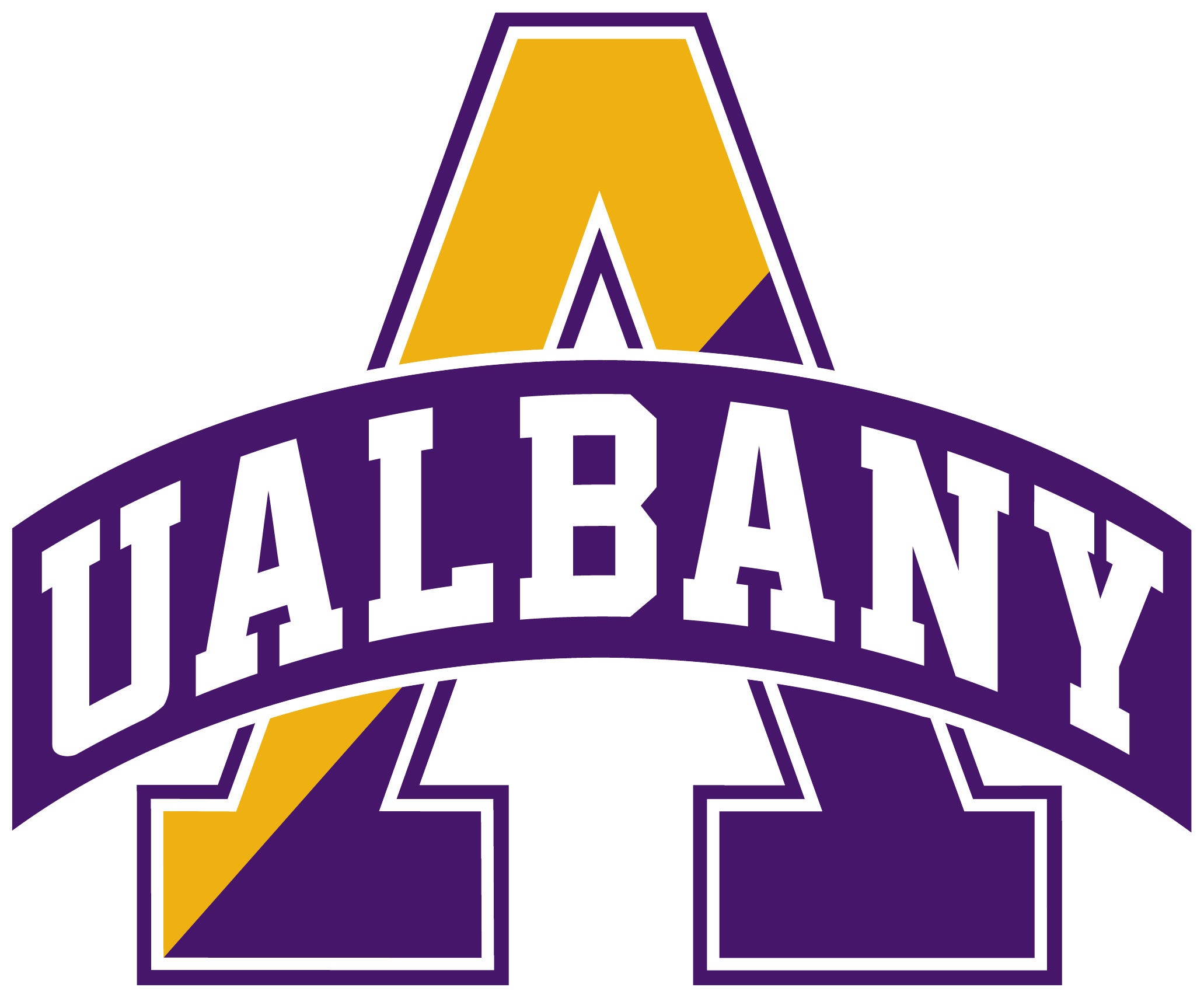
Don’t worry – you don’t have to throw out old merch, but the official branding is moving on. Graphically, ascetically, I wasn’t ever really a big fan of the big Split-A, but it did have a collegiate vibe.
Before the Big Split-A settles into the eventually forgotten dustbin of discarded UAlbany logos and mottos, let’s derive some lessons, messages and symbolism of this longtime UAlbany logo:
The A-Split between Purple and Gold: Gold is a lighter brighter color, purple is darker and deeper, especially the tone of UAlbany purple. The contrast makes them beautiful. Those who know me know how much I appreciate the dual-wavelength, the opposing dialectic, the paradoxical synthesis, the fusion that is at the heart of Chassidus. I call this Chassidic synthesis: Chasynthesis. (We built a game and curriculum on this theme, and it’s something I think about a lot). It’s the harmonious balance of higher and lower, the natural and the challenging, simple and complex, spiritual and physical, infinite and finite, beyond the world and within the world, light and dark etc etc… Having a Split-A can symbolize the duality of mission, unified by the singularity of purpose.
The (Shape of the) Letter A: There’s something to be said about that first letter of the alphabet, it’s the start of everything. In Hebrew the “Alef” (first Hebrew letter) carries so much meaning, importance and significance. But also the shape: “A” can be seen as an upwards arrow, yearning and striving and rising higher even as it is firmly grounded and balanced below. Like Excelsior, the New York State motto: Ever Upward. The bottom of the A may be wider and stronger, but direction is key. It’s not where you are but where you are headed.
Don’t Dismiss the Basics: It may feel beneath the dignity of higher-ed to be stuck back at the first letter – and a single letter at that. Going with Minerva or Great Dane are both images, and a picture is a thousand words. But one letter? The first letter? That feels Kindergarten-like! We’re talking students who are writing long research papers and wordy essays. We have to move past the Letter A. Nah, this attitude may be a mistake. The basics are always at the core of all sophistication, one can not lose sight of the building blocks. There’s the simplicity below and preceding complexity and sophistication, but also a simplicity that surpasses and transcends it. You can have a PhD, and yet always be at a letter A of your academic and personal growth journey.